Ignition Edge – Vision Module
This is the Ignition Designer, the primary tool used to design and configure SCADA applications in Ignition. You’re in a Vision project (used to build traditional HMIs, mostly for desktop use). Here’s a breakdown of the interface:
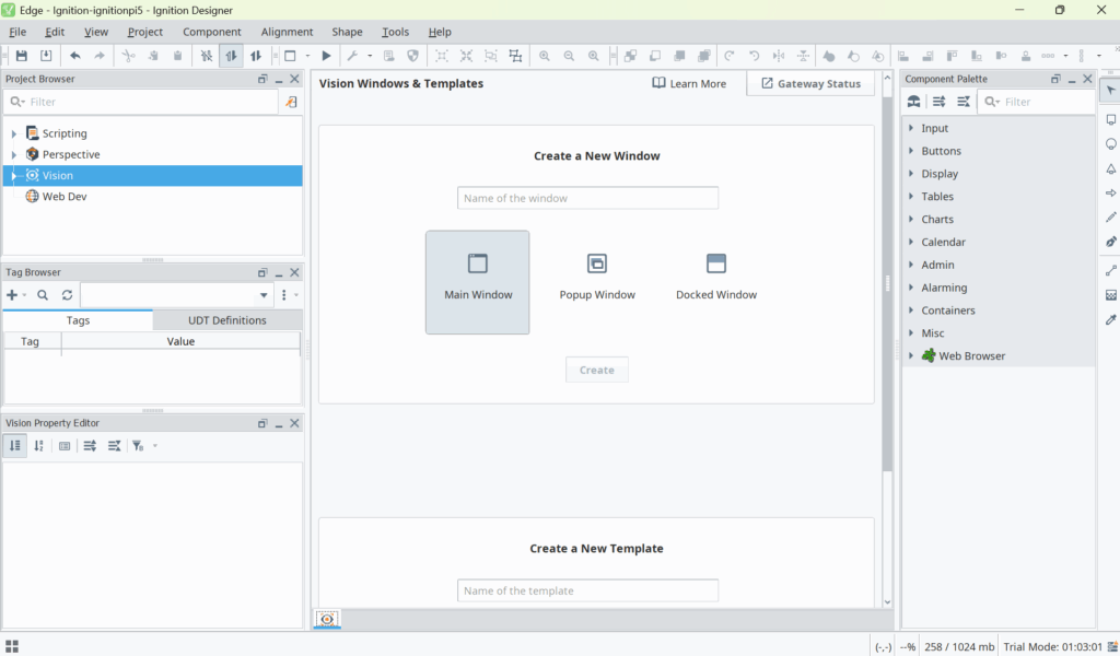
🗂️ 1. Project Browser (Top Left Panel)
This shows all the resources available in your project:
- Scripting: Python-based scripts you can create to automate things.
- Perspective: For web/mobile HMI design (you’re in Vision mode now, but Perspective is there too).
- Vision: This is where you’ll design fixed-layout HMI screens (windows, templates).
- Web Dev: Only used if you’ve installed the Web Dev module (for custom APIs, etc.).
🏷️ 2. Tag Browser (Middle Left Panel)
This is where you manage Tags, which are real-time values like sensor readings, motor states, etc.
- Tags Tab: Shows your live tags.
- UDT Definitions Tab: Lets you define reusable tag structures (User Defined Types), such as for a motor or valve.
🛠️ 3. Vision Windows & Templates (Main Center Panel)
You’re currently in the “Create a New Window” area. This is where you create your HMI screens.
You can choose from:
- Main Window: Full-size view for main screens (usually always open).
- Popup Window: Small window for alerts/settings, opens on demand.
- Docked Window: Always attached to one side of the screen (e.g., navigation panel).
📦 4. Component Palette (Right Sidebar)
This is where you drag and drop visual components onto your windows.
Categories include:
- Input: Fields users type into.
- Buttons: For triggering actions.
- Display, Charts, Controls: Additional elements like labels, LEDs, tables, etc.
Example:
Button: Clickable element for actions.2-State Toggle: On/Off switch (e.g., for motors or valves).Slider: For numeric input with sliding control.
🧬 5. Vision Property Editor (Bottom Left Panel)
When you select a component (like a Button), its properties appear here. This is where you:
- Change names
- Bind properties (e.g., a Label shows a Tag value)
- Style elements (colors, fonts, visibility, etc.)
⚙️ 6. Top Toolbar (File, Edit, Component, Tools, etc.)
This gives you access to:
- Save your project
- Launch Clients
- Create Templates
- Import/Export components
- Tools like the Tag Browser, Property Editor, Alarm Journal, etc.
📊 7. Status Bar (Bottom of Screen)
This gives you info like:
- Memory usage (
232 / 1024 mb) - Trial mode timer: You’re running in free mode — it resets every 2 hours unless licensed.
🧪 Next Step: Create Your First HMI Window
Let’s get hands-on:
- Click Main Window.
- Name it something like
MainScreen. - Click Create.
- From the Component Palette on the right, drag a Button onto the screen.
- In the Property Editor, change the text to
Start Motor.
You’ve just built your first basic control interface!
Ignition Edge – Perspective Module
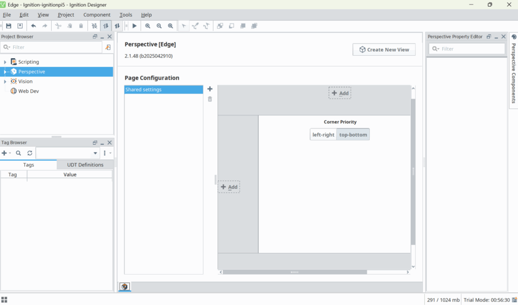
This is the Perspective Module interface, ideal for web and mobile dashboards. Everything you create here runs in a browser (no separate client required).
This is the Perspective Module interface, ideal for web and mobile dashboards. Everything you create here runs in a browser (no separate client required).
🗂️ 1. Project Browser (Top Left Panel)
You’re now focused on Perspective (blue highlight). This means you’re designing web-based views rather than traditional desktop ones (Vision).
Folders here include:
- Scripting – Same as Vision: global Python scripts.
- Perspective – Contains views, styles, session properties.
- Vision – Still present, but unused when working in Perspective.
- Web Dev – For custom APIs (if enabled).
🏷️ 2. Tag Browser (Bottom Left Panel)
This is where you’ll see real-world PLC/OPC tags or memory tags.
- You can create tags with the
+button (useful for testing your UI). - These tags can be bound to components inside your Perspective views.
Still empty here — ready for your first tag!
🧱 3. Page Configuration Area (Center Panel)
This is the Perspective > Page Configuration tool.
You’re defining how pages and views load and align inside the web browser.
- The large area is a layout map for docked views.
- + Add buttons let you place docked components (e.g., a side menu).
- Corner Priority affects how the page decides docked view priority.
🔹 You haven’t yet created a View (the core design unit in Perspective), so it’s blank for now.
📄 4. Create New View (Top Center Button)
This is the next step — click this to start building your first HMI screen.
A “View” in Perspective is like a webpage: it contains components, data bindings, and logic.
You’ll choose:
- View Name (e.g.,
MainPage) - Root Container Type (Coordinate, Column, Flex, Breakpoint)
- Start with Coordinate if you want absolute positioning (like Vision).
- Use Flex or Column for responsive layouts.
🛠️ 5. Perspective Property Editor (Top Right Panel)
Once you select a component in your view, this panel shows:
- Bindable properties (e.g.,
text,value,visible) - Styling options (colors, spacing)
- Events (onClick, onHover, etc.)
Currently blank because no component is selected yet.
🧩 6. Perspective Components (Far Right Tab)
Collapsed for now, but once expanded, this gives you drag-and-drop access to:
- Inputs (Text Fields, Sliders, Toggles)
- Displays (Labels, Icons, Charts)
- Containers (Flex, Coordinate, Breakpoint)
- Embedded Views, Power Charts, and more.
These components are what you’ll use to build dashboards.
🧪 Trial Info (Bottom Right Status Bar)
You’re running in Trial Mode, with 56 minutes left before reset is needed.
Also shows memory usage: 291 / 1024 mb.
✅ Next Steps (Your First Web HMI):
Here’s what to do next:
- Click
Create New View - Name it:
MainPage - Root Container Type: Coordinate
- Click OK
- From the Perspective Components, drag a Button into the view
- In the Property Editor, change the
texttoStart Pump
And done — that’s your first Perspective HMI screen!